Lettering with presence
The large, expressive name carries the identity. Its proportions and surrounding flourishes give the composition movement while keeping the brand name prominent.
BRAND IDENTITY / SPIRITS
Character in
every detail.
THE DESIGN FOCUS
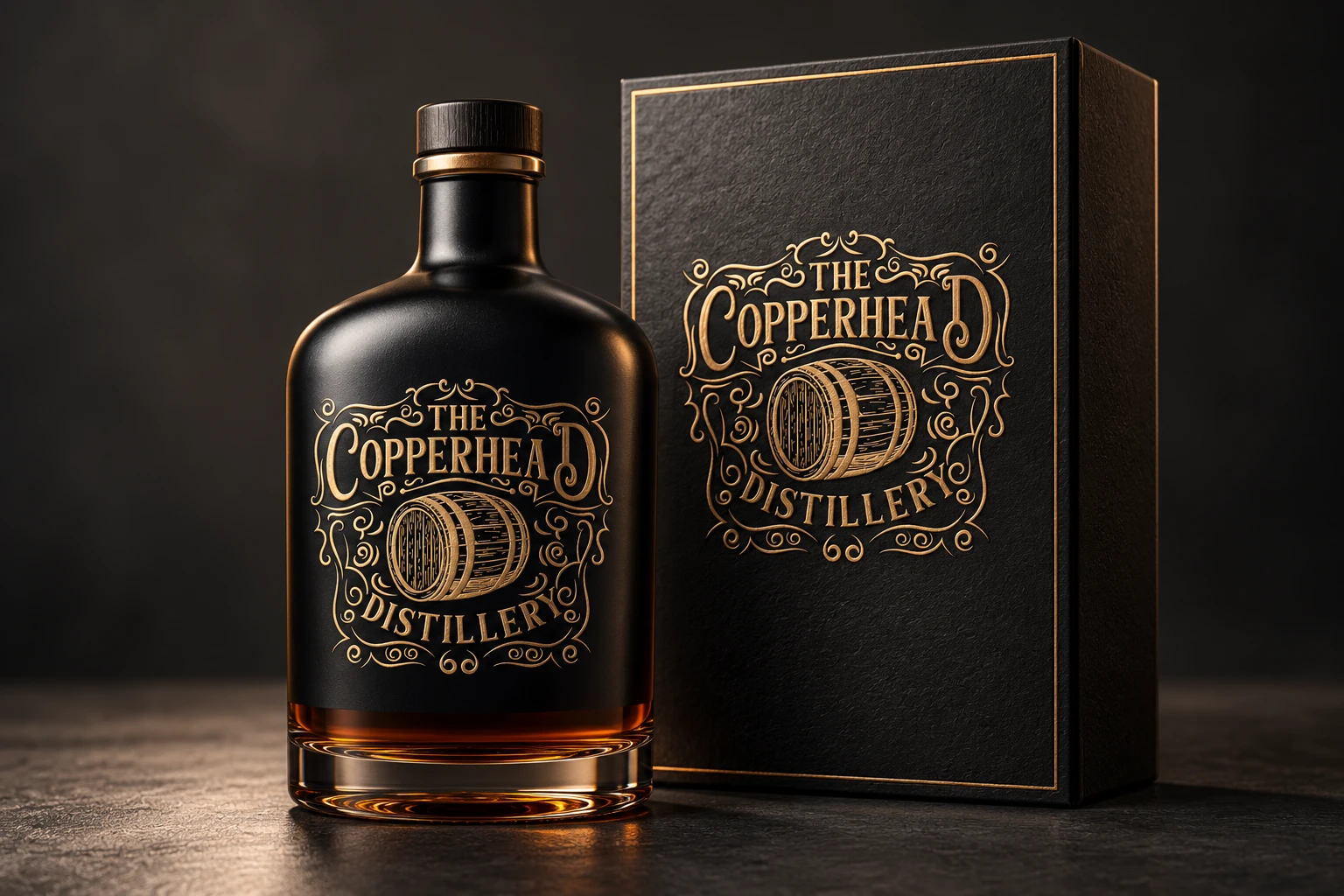
An expressive distillery identity built around detailed lettering and a barrel illustration. A study in giving a brand a recognisable character across its visual presentation.
The identity places the Copperhead name at the centre of a detailed emblem. Curved lettering, ornamental lines and the barrel illustration create a visual reference to the craft and tradition associated with distilling.
FROM MARK TO APPLICATION
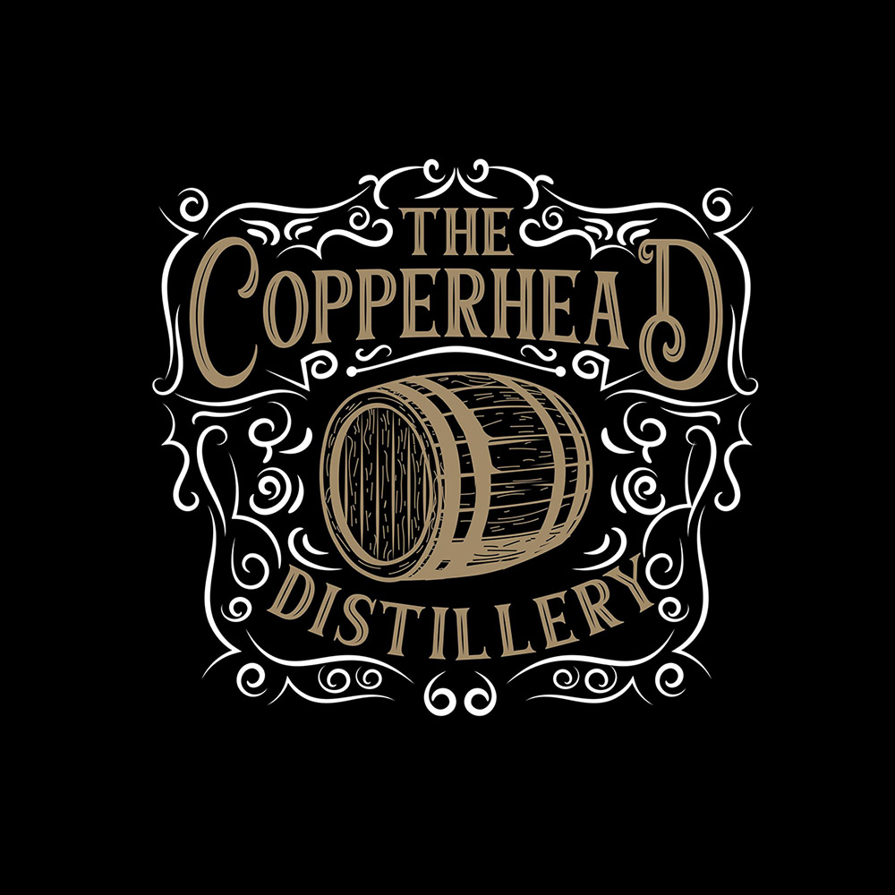
The identity artwork sits alongside refreshed mockup presentations to show how the visual language can carry across different formats.
A CLOSER LOOK
The large, expressive name carries the identity. Its proportions and surrounding flourishes give the composition movement while keeping the brand name prominent.
The barrel adds a clear category reference. Fine lines and curved details connect the illustration to the lettering so the mark reads as one composition.
The black-and-gold mockup presentation allows the detail to stand out. Repeating the identity across the bottle and box shows how the same mark can connect different applications.
The defining feature is the relationship between the name and the illustration. Supporting elements reinforce that central identity instead of competing with it.
Explore branding & logo designBASED IN MELBOURNE. WORKING WORLDWIDE.
Let’s discuss the audience, the idea and the applications your brand needs.
Current prices, inclusions and terms are shown in the store you choose. Purchases are completed there.