A symbol tied to the name
The crescent is both a framing device and the main identifying element. Its open shape creates a natural relationship with the wordmark.
BRAND IDENTITY / BEAUTY
A delicate crescent.
A confident presence.
THE DESIGN FOCUS
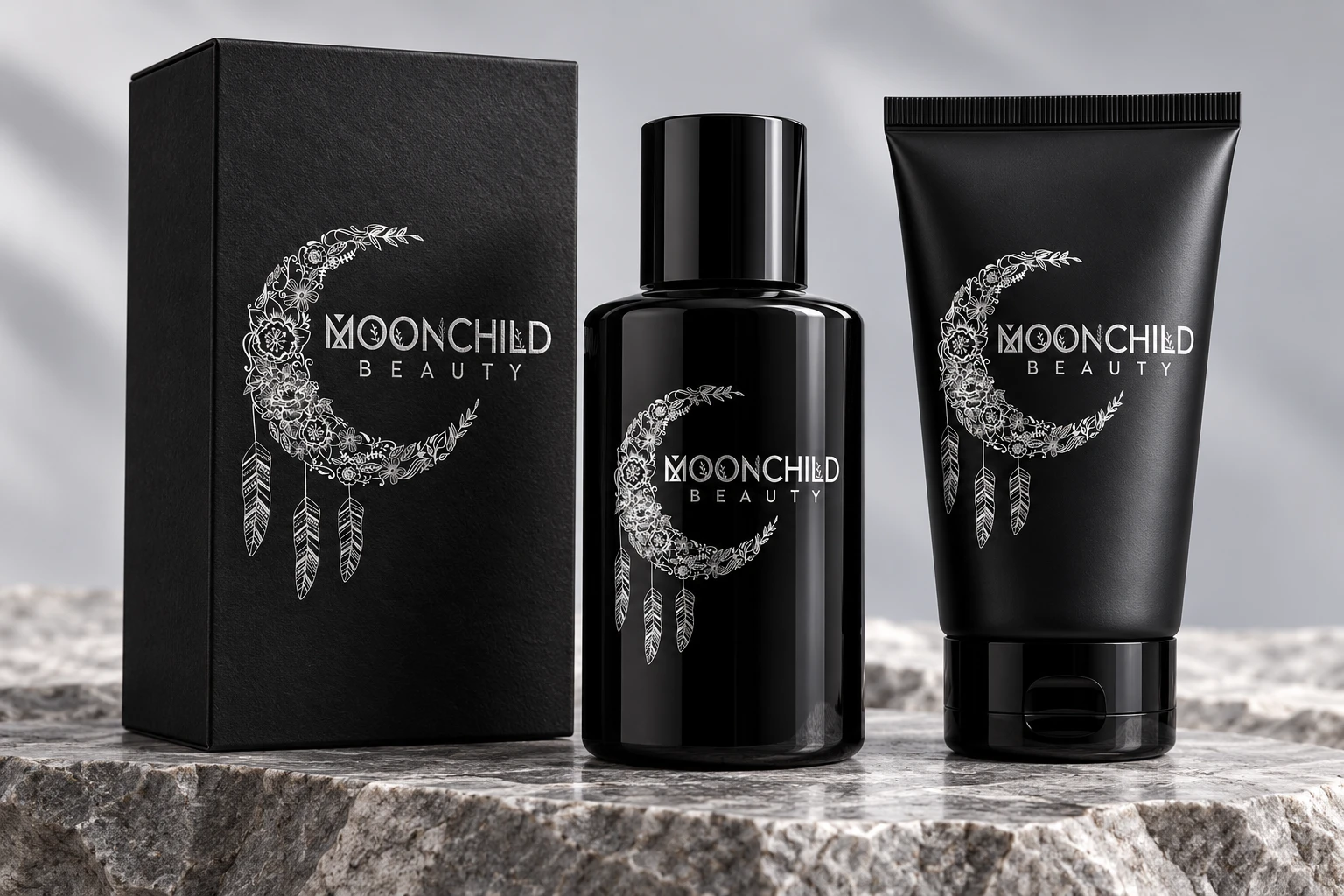
A beauty identity that pairs intricate botanical illustration with a simple, confident name. Fine detail creates the character; the surrounding space gives it room to be seen.
The crescent creates an immediate connection to the Moonchild name. Botanical forms and hanging feather details give the symbol an illustrative quality, while the lettering provides a quieter counterpart.
FROM MARK TO APPLICATION
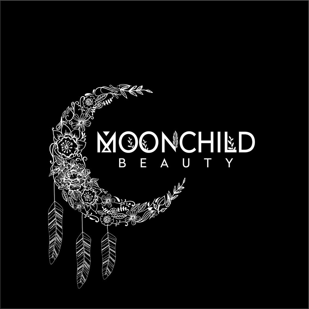
The identity artwork sits alongside refreshed mockup presentations to show how the visual language can carry across different formats.
A CLOSER LOOK
The crescent is both a framing device and the main identifying element. Its open shape creates a natural relationship with the wordmark.
The linework is intricate, so the supporting composition stays restrained. Space around the mark helps separate the delicate illustration from its surroundings.
The monochrome mockup presentation carries the identity across a carton, bottle and tube. The repeated symbol and lettering connect the different formats.
An identity does not need many competing elements to have personality. Here, the detailed crescent supplies the character and the restrained presentation keeps attention on it.
Explore branding & logo designBASED IN MELBOURNE. WORKING WORLDWIDE.
Let’s discuss the audience, the idea and the applications your brand needs.
Current prices, inclusions and terms are shown in the store you choose. Purchases are completed there.