Flavour through colour
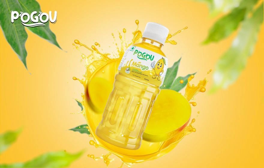
Mango-yellow dominates the composition, connecting the liquid, fruit and background. Green provides a contrasting accent for the brand and natural elements.
PACKAGING & PRODUCT VISUALS / BEVERAGES
Full of colour.
Clear on flavour.
THE DESIGN FOCUS
A bright mango-drink presentation that brings the bottle, fruit and brand together in one energetic image. The product remains the focal point throughout.
The featured visual uses the yellow of the drink and mango as its main colour. Green brand details and leaves provide contrast, while the bottle stays central. The label and surrounding imagery communicate the same flavour story.
A CLOSER LOOK
Mango-yellow dominates the composition, connecting the liquid, fruit and background. Green provides a contrasting accent for the brand and natural elements.
A tilted product and surrounding splash give the image energy. The label remains visible so the product identity is part of the composition, not an afterthought.
The label identifies the drink while the larger visual builds a sense of flavour. The two scales work together: product information on the bottle and a clear impression around it.
When packaging and product visuals share a clear idea, the product can remain recognisable in a more expressive composition. In this example, colour and fruit imagery reinforce the same mango flavour.
Explore packaging & label designBASED IN MELBOURNE. WORKING WORLDWIDE.
Let’s discuss the audience, the idea and the applications your brand needs.
Current prices, inclusions and terms are shown in the store you choose. Purchases are completed there.